


Good Chart Bad Chart Guide part 2


Sorting out rough opal stones by natural colour is best done visually on a silver or white tray. Black trays boost the colour artificially. For any list of stocks, clicking through each chart is also an eyeballing process. Experience over many years helps make separating the ‘good setups’ from the ‘stocks to avoid’ an easier task. These are some of the features I watch out for in the early sorting stages of my search for a good stock.
Stocks to Avoid
LOWER PROBABILITY SETUPS
🔴⚠️ Lack of Trader/Investor Interest
Compressed moving averages in the short-term and long-term GMMA shows a lack of interest from traders and investors.
Price had been going sideways for a couple of weeks on the chart of GHY as traders and investors were in agreement in price.

🔴⚠️ Resistance Levels
Support/resistance levels may prevent price achieving our profit targets.
On the chart of LOT, opening a position at this point may encounter resistance at 0.38 and price may not reach a profit target set over this price.

🔴⚠️ Low Trading Activity
Price is too spotty with no trade days or is too boxy. It is harder to fill entry and exit positions. In the chart of AAU, price action shows both types of trading days. There are no signs of any price breakouts while price is in a sideways consolidation.

🔴⚠️ Steep Price Action
Fast move where the GMMA groups are sloping steeply upwards. There is a risk of collapse in price.
The chart of MTH is an example of a chart I prefer to avoid trading. Next day, price went on to a high of 0.185 then fell over a couple of weeks to a low of 0.433. A drop of 134%!

Another example of a steep price rise is on the chart of C1X, price is printing steeply and the GMMA is rising in a steep slope. On the last candle printed, price touched the high of this chart at 0.685 then fell over the next 10 days to 0.325.

🔴⚠️ Ballooning
Ballooning of GMMA lines. If the exponential moving averages are too widely separated or the gap between the short and long-term groups is too wide, the trend is not sustainable and price usually cannot keep its momentum. Price eventually pulls back.

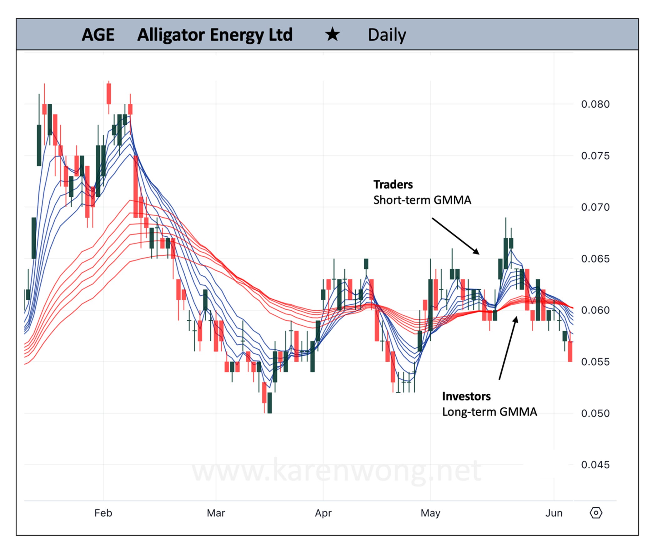
🔴⚠️ Weak Long-Term GMMA
If the long-term GMMA is too compressed despite an uptrend order, it means lack of support from investors and will most likely not provide a strong foundation for any short-term pullbacks in price.
On the chart of AGE, the uptrend leg emerging during May was weak, failing to develop as the short-term group fell through the compressed long-term group.
🔴⚠️ One Day Spike
A double digit price move over one trading session is exciting. First response is often FOMO, especially when the stock has been in an uptrend. A better first response is one of caution, knowing the probability of price pulling back over the next couple of sessions is high.
On the CTT chart, price moved 79% in one day. Over the next few days, the stock gave back at least 20% of this move. It’s not a good entry point.

🔴⚠️ GMMA in Downtrend Order
Never a good idea to trade against a dominant trend.
On the chart of WBT, the GMMA groups are in a downtrend order. Both traders and investors were selling the stock off over time. Price made a number of unsuccessful attempts to break through the long-term GMMA but the investor selling was too strong and price fell back.

A chart may have one or more of the features in this article providing a clearer picture of the stock. This is the initial interest stage of eyeballing and separating out the higher probability set ups in the charts. For further analysis, other indicators such as RSI, ROC or Heikin-Ashi candles may be applied over the chart for added confirmation of trade potential.
For Part 1 of the Good Chart Bad Chart Guide containing the Higher Probability Chart setups click here