

Good Chart Bad Chart Guide part 1


Sorting out rough opal stones by natural colour is best done visually on a silver or white tray. Black trays boost the colour artificially. For any list of stocks, clicking through each chart is also an eyeballing process. Experience over many years helps make separating the ‘good setups’ from the ‘stocks to avoid’ an easier task. These are some of the features I watch out for in the early stages of my search for a good stock.
HIGHER PROBABILITY SETUPS
🟢📈 Uptrend
The chart below is a great looking steady uptrend. Strength of the trend is shown where the exponential moving averages are well separated in both the short-term and long-term GMMA. A steady uptrend is more likely to hold up and less prone to a sudden collapse.
Match an uptrend on a daily chart with an uptrend on a weekly chart for double confirmation of an uptrend continuation.

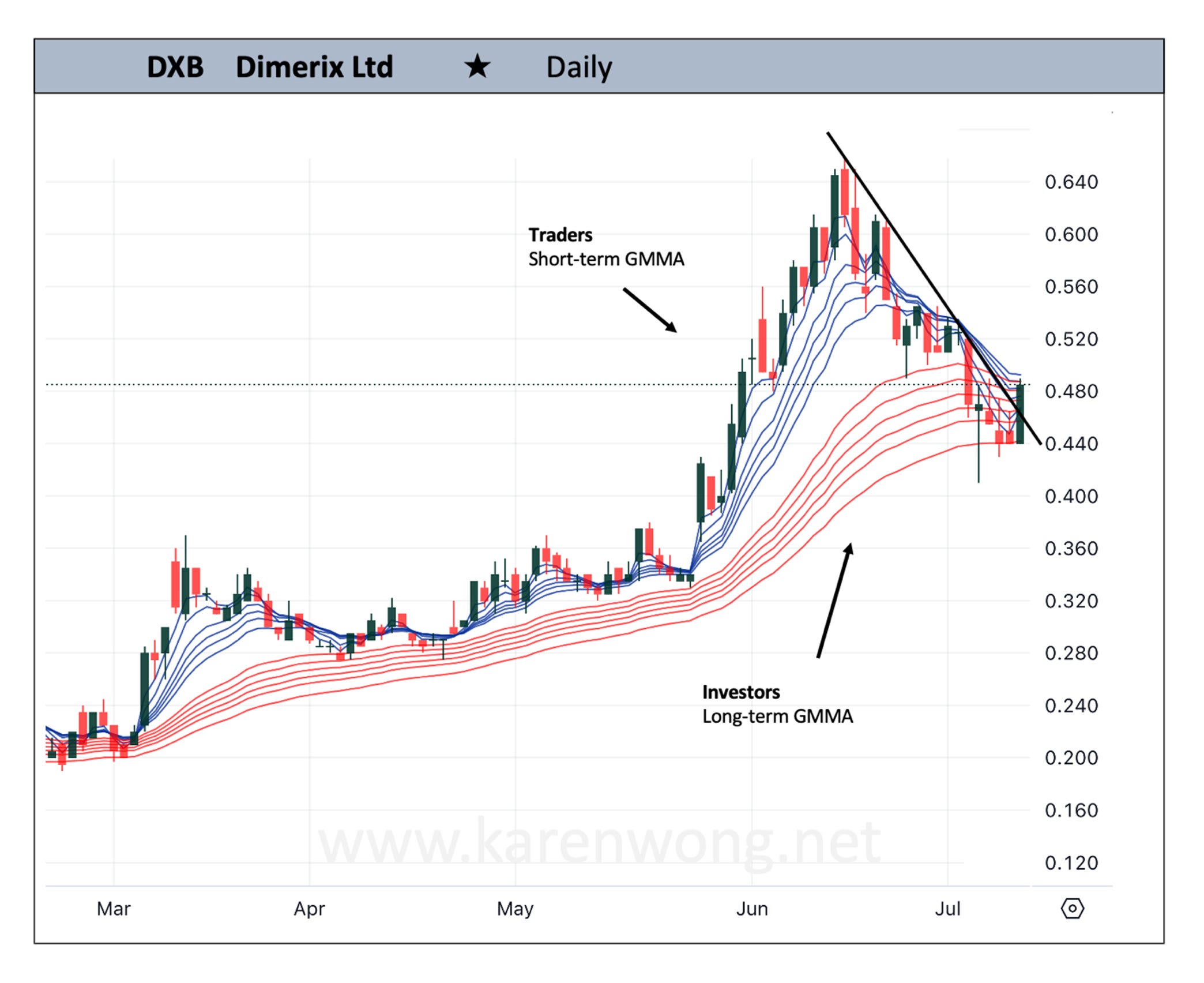
🟢📈 Trendline breakout
A break through a downtrend line and a price close above the line has the potential to continue. On the chart of DXB, the bounce off the lower edge of a supportive long-term GMMA adds to evidence of a potential turnaround in price.
🟢📈 Trendline Retest
Strong trendlines where price has hit and retested the line at least 3 times. The more hits by price on the trendline, the stronger the trendline and a more stable price move.
The new leg emerging on the chart of VCX was a good example of using a trendline to open a position in the first few days of a new leg emerging in the uptrend.

🟢📈 Regular Price Activity
We want regular trading and higher volumes. It is obvious to the eye when a stock is traded frequently like this chart of SUM. Price activity flows more naturally and it appears regular.
Check for volume levels using an indicator or looking at data on a website or trading platform.

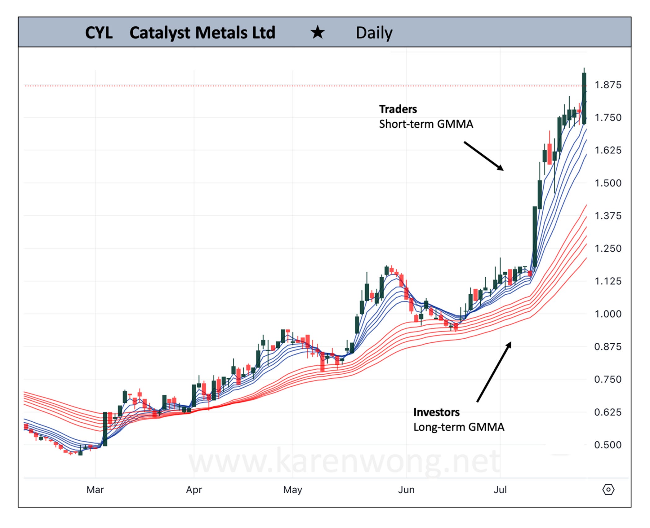
🟢📈 Widely separated Exponential Moving Averages of long-term GMMA
Pullback in price against a supportive long-term GMMA increases the likelihood of price recovery back to the upside. Widely separated Exponential Moving Averages signal how investors are in good support of the trend and are buying the stock.
On the very right side of the chart CYL, the most recent price pulled back towards the upper edge of the long-term GMMA. From this area, price made a 55% move from $1.80 to $2.80 a couple of weeks later.
🟢📈 Bullish RSI Divergence
When price makes a lower low at the same time a momentum indicator like the RSI makes a higher low, there is a possibility of price moving to the upside. It is not a standalone signal. Other indicators should be used for confirming the potential move.
An existing GMMA uptrend increases the probability of an upward move playing out. A stock showing early signals of a trend change also increases the probability.
Price made a nice move after the RSI divergence on the chart of MIN. The day after the current candle on the very right side of this chart, price spiked up 14%.

Part 2 of this article takes a closer look at some Lower Probability Setups. Click here to read
Great update
Thanks